Data Guide
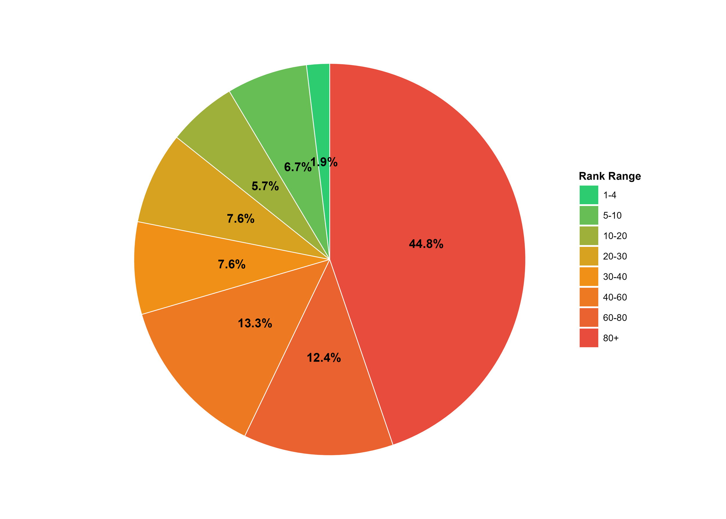
This is an example of what our school pages look like. The top pie chart on the right is the proportion of students who matched into the stated residency rank group from the medical school. A strong medical school will have a high proportion matching into the 1st to 4th ranked medical schools (1-4) and 5th through 10th (5-10).
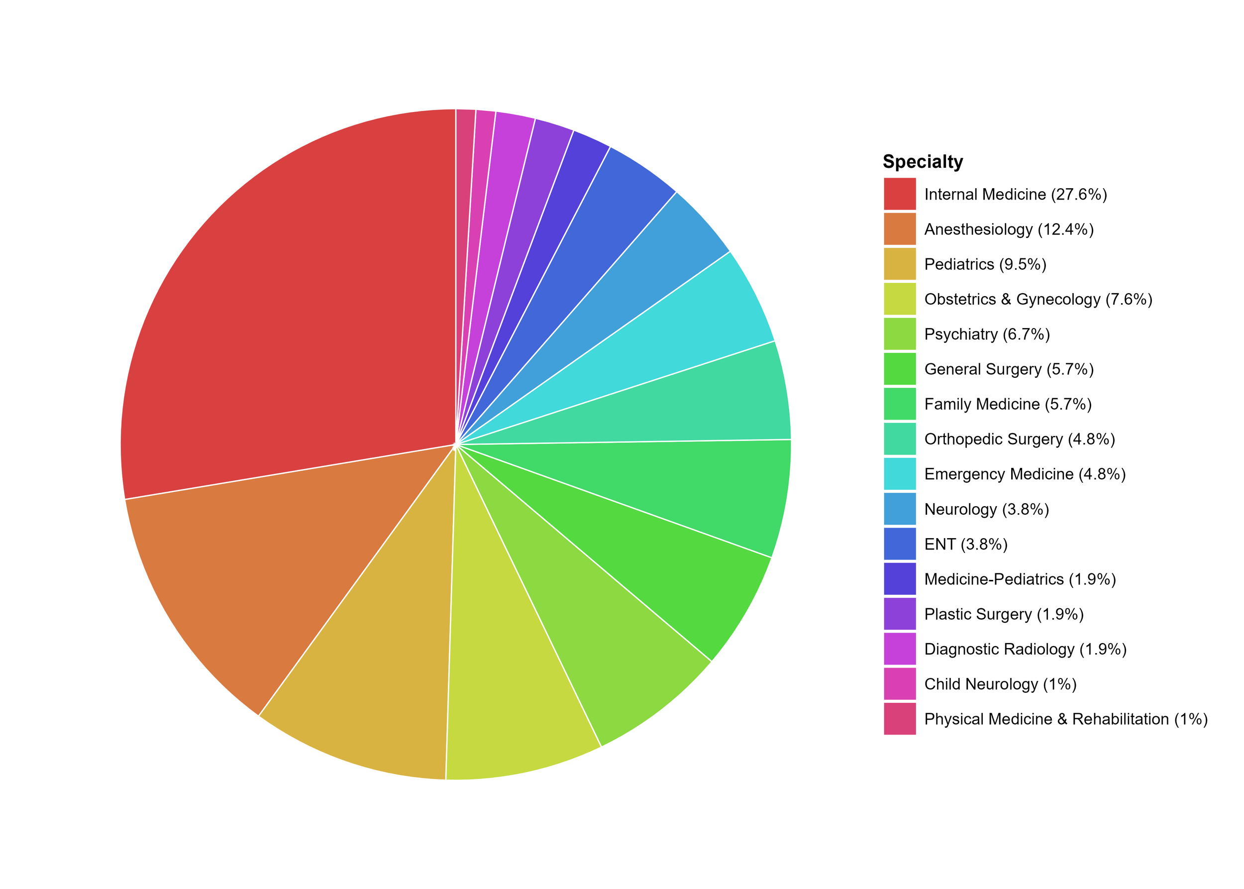
The bottom pie chart is the proportion of students at the medical school that matched into each specialty by color and proportion.
Any points value reported is to compare magnitude of differences between ranks.
Normalized Ranking:
This ranking is generated by multiplying the number in each ranking bucket by a point value assigned to each ranking bucket. A high normalized ranking means that a large proportion of students at the medical school matched to high ranking residency programs.
Specialty Score:
This ranking is the normalized ranking but multiplied by an index to adjust for specialty competitiveness. A higher speciality rank than general rank implies this school is matching to more competitive specialties, a lower speciality rank than general rank implies a school has more matches into family medicine and other less competitive fields.
Specialties more common than mean:
These are specialties that at the medical school represented have a proportion 1 standard deviation more common than the mean proportion.
Total Points:
This is the total points the medical school was given. A low total point value may mean the school had a low overall number of students with match data eligible to be found. A high value should not be interpreted as positive or negative.